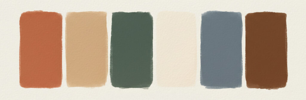
2026 is the year of warm, earthy tones, and that's a technical challenge. 🍂
Design trends are shifting back to warmth. Pantone and color trendsetters are highlighting nature-inspired palettes like warm mahogany depths and smoky jade greens like Behr's Hidden Gem.
The aesthetic blends Scandinavian minimalism with Japanese earth tones, which are beautiful in design but technically demanding in digital print. Achieving deep, warm colors without muddying the results requires precise color management. Rich mahogany can easily look brown and flat if your profiles and conversions aren't dialed in. Subtle warm greens can shift cool or lose their depth.
These aren't the punchy, saturated colors digital presses handle easily. They're nuanced, layered tones that demand accurate device profiling for your specific substrates, proper rendering intent selection for warm, muted palettes, quality control systems that catch subtle shifts, and understanding of how ink layering creates (or destroys) warmth.
As designers embrace earth tones and warm neutrals, print operations need color management systems tuned for subtlety, not just vibrancy. Is your color management system ready for the "Scandinese" aesthetic? The technical demands are different than last year's bright, bold palettes.
#ColorTrends2026 #ColorManagement #Scandinese #DigitalPrint #EarthTones
Contact us now and find out how we can provide elegant solutions – to bring you out of chaos

We are standing by and ready to help. Just fill in your details and we will contact you shortly!
Your perfect workflow is just a few clicks away. Fill out the form and let's get things started.