Roses are red... but which Pantone are we talking about?
At Rods and Cones, we don’t just see red, we see a world of precision, CMYK builds, and spot color perfection.
This Valentine’s Day, we’re falling in love with our favorite shades of the season, because in the print world, the wrong red can mean the difference between true love and major heartbreak at the press.
Which red is your print operation’s perfect match?
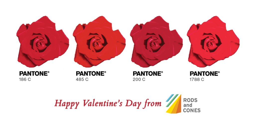
🌹 Pantone 186 C: The Classic. Bold, timeless, and the gold standard for a reason. If this were a Valentine, it would be a dozen long-stemmed roses.
🌹 Pantone 485 C: The Firecracker. Bright, vibrant, and impossible to ignore. It’s the color of first date conversations that go late into the night.
🌹 Pantone 200 C: The Sophisticate. A bit deeper, a bit richer. Perfect for those high-end finishes that need to scream "luxury."
🌹 Pantone 1788 C: The Flirt. It has a touch of warmth and a lot of energy, perfect for high-speed production that pops.
We're wishing all our fellow print nerds a Valentine’s Day filled with exact color matches, perfect registration, and zero ink drying issues.
What’s your all-time favorite red? Drop the PMS code in the comments.
#RodsAndCones #PrintIndustry #Pantone #Enfocus #PrintAutomation #ValentinesDay2026 #ColorManagement #Prepress
Contact us now and find out how we can provide elegant solutions – to bring you out of chaos

We are standing by and ready to help. Just fill in your details and we will contact you shortly!
Your perfect workflow is just a few clicks away. Fill out the form and let's get things started.