A St. Patrick's Day meditation on metamerism, rich blacks, and what our eyes are missing
Every St. Patrick's Day, millions of pints of Guinness are poured and people across the world try to “split the G”. While most beer admirers see a beautifully dark, black stout topped with a creamy white head, those who work in color management see something else entirely: A masterclass in why we don't always trust our eyes, and instead reach for our trusty spectrophotometers.
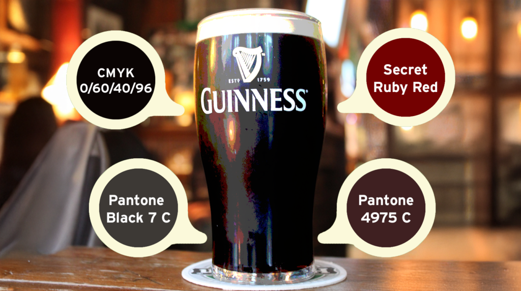
As you may have guessed, Guinness is not true black. Technically, scientifically, spectrophotometrically, and intrinsically beautifully, Guinness is actually a very dark ruby red.
This unique color originates from the roasting process before brewing. The barley used in Guinness is roasted at exactly 232°C (449.6ºF), which produces those deep garnet and burgundy pigments that absorb most visible light. In a dimly lit pub where very little light passes through the liquid, our visual system interprets this color as black, but take that same pint, hold it up to a window or a D50 light source, and watch what happens at the edges of the glass. A rich, warm, almost jewel-like ruby glow emerges, which is the depth of the beer revealing itself the moment it has enough light to show us its true colors.
For anyone outside the color industry, this might read as a fun bit of trivia. For those of us on the inside, it's a perfect illustration of one of the most important, and most misunderstood, concepts in our field.
Metamerism is the phenomenon by which a color appears to change depending on the light source illuminating it. Two objects can appear to match perfectly under one light and look completely different under another. This isn’t an optical illusion, it's physics. Different light sources emit different spectral energy distributions, and our eyes respond to that energy differently depending on the surface, or dreamy beer, in front of us.
In the case of Guinness, only under broader-spectrum daylight or a calibrated D50 viewing booth will the spectral reflectance of those roasted barley pigments begin to come through, revealing the rich ruby red hidden in the glass. The color hasn't changed, the light has, and that distinction is everything.
This is precisely why color professionals calibrate their viewing environments. A color decision made under the wrong light source isn't a color decision, it's a guess. The same logic applies whether you're evaluating a proof, approving a brand color on press, or, apparently, ordering a stout.
For anyone working in print production, black isn’t the absence of color, but actually a complex combination of colors that can vary depending on the desired effect.
"Black" is one of the most deceptively complex colors to reproduce accurately. Standard process black (100K) often reads as flat and slightly cool on press. Rich blacks built from four-color mixes offer more depth, but the formula matters enormously. Lean too far toward cyan and you get a cold, almost bluish black. Build it poorly and you risk muddiness, ink layering problems, or a result that simply doesn't match the intended tone.
The Guinness brand navigates this deliberately. Rather than relying on a standard black, their branding typically employs a rich black built around a CMYK formula of approximately 0/60/40/96, which is a mix that biases warmth, preventing the logo from reading cold or flat across different substrates and printing conditions. The warmth is intentional, and echoes the roasted character of the product itself.
For Pantone matching, the story is equally nuanced. Black 6 C, the most commonly reached-for option when a designer wants a "deep black", carries a notable blue undertone that would miss or clash with the warmth of the Guinness character. Two alternatives come much closer. Pantone Black 7 C captures the shadow appearance of the beer in the glass. It’s a heavy, warm black that leans toward deep chocolate and burgundy rather than blue. Pantone 4975 C goes further, representing what a spectrophotometer actually finds. That deep, rich maroon that reflects the roasted barley at the heart of the brew.
Neither match is accidental. Both require understanding of not just what a color looks like, but what it actually is.
The broader lesson here isn't really about beer. It's about the gap between perception and measurement, which is a gap that color management professionals exist to close.
Human vision is remarkable, but it is also largely contextual. We adapt to light sources automatically, interpret colors relative to their surroundings, and fill in information our eyes don't fully capture. These adaptations serve us well in daily life, but in a professional color environment, they’re a liability. The eye that just walked in from bright sunlight is not the same eye that's been in the pressroom for three hours. The brain that expects something to be black will, with remarkable reliability, see black, even when the spectral data says otherwise.
This is why we standardize viewing conditions by using spectrophotometers rather than relying on visual approval alone. Soft proofing environments are calibrated to known standards and press checks happen under controlled light for this purpose. The goal is always to replace subjective perception with objective, repeatable data.
Guinness has been poured for over 260 years, and for most of that time, the world has called it “the black stuff”, but the spectrophotometer has been politely disagreeing the entire time. This St. Patrick's Day, raise a glass to the data, and if you happen to hold that glass up to the light, you'll know exactly what you're looking at.
Cheers, and happy Saint Patrick’s Day from Rods and Cones. ☘️
Contact us now and find out how we can provide elegant solutions – to bring you out of chaos

We are standing by and ready to help. Just fill in your details and we will contact you shortly!
Your perfect workflow is just a few clicks away. Fill out the form and let's get things started.